Responsive HTML Tables
Intro
HTML tables are the best way to format data on a webpage. As the internet evolved to more responsive web pages tables were left behind. When you get to small screens, tables became less usable. In this article, I’ll show you how to fix your tables and make them usable on small screens.
Prerequisites:
- Some HTML knowledge.
- Some CSS knowledge.
Setting up the table
First, format your data in a table as you would on a large screen. When formatting your table, decide how to organize your columns. Here is our basic HTML table. And what the table looks like.
<table>
  <thead>
    <tr>
      <th>Super Hero</th>
      <th>Super Power</th>
      <th>Comic Company</th>
    </tr>
  </thead>
  <tbody>
    <tr>
      <td data-title="Super Hero:">Batman</td>
      <td data-title="Super Power:">Rich guy</td>
      <td data-title="Comic Company:">DC Comics</t>
    </tr>
    <tr>
      <td data-title="Super Hero:">Superman</td>
      <td data-title="Super Power:">Flight, strength, laser eyes</t>
      <td data-title="Comic Company:">DC Comics</td>
    </tr>
    <tr>
      <td data-title="Super Hero:">Spiderman</td>
      <td data-title="Super Power:">Spidey senses, web spray</t>
      <td data-title="Comic Company:">Marvel Comics</td>
    </tr>
  </tbody>
</table>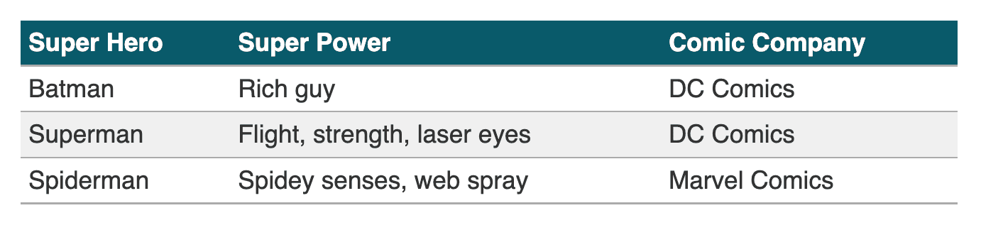
The less useful way to make tables responsive is by making the table scrollable to the left and right. The simple way to do this is by adding this CSS overflow-x:auto to your table. This works, and it works well enough in a pinch, but I’ll show you how to make more usable data tables.
Making the table more responsive
The next step is to format the table styles to work responsively. Make the table elements display as block elements.
@media (max-width: 768px) {
  table, thead, tbody, th, td, tr {
    display: block;
  }
}
We also need to hide the standard table header on mobile.
@media (max-width: 768px) {
  thead tr {
    position: absolute;
    top: -9999px;
    left: -9999px;
  }
}
Information positioning
Now we will position the header information to the left and the column data to the right. To do this, we can use display grid on each td element. This makes the data more accessible for people with memory issues.
@media (max-width: 768px) {
  td {
    display: grid;
    grid-column: 1fr;
    grid-template-columns: 1fr 1fr;
    line-height: 1.5;
    border-bottom: 1px solid #999;
  }

  td:before {
    font-weight: bold;
    content: attr(data-title);
  }
}
Notice in the CSS, we added content: attr(data-title); on the before element. By doing this, the content for the before element uses the data from the data-title. Using the data-title, it makes the CSS reusable for other data tables. Note, it’s important to add spacing between sections of data on mobile.
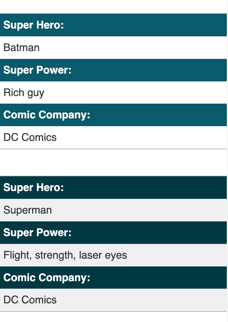
Smaller screen support
Finally, I’ve added CSS on smaller screen sizes to stack the heading and table data together. This way, we don’t have to worry about the short line lengths when the two columns get pushed together.
@media (max-width: 480px) {
  td {
    grid-template-columns: 1fr;
  }
}
Final CSS
This is the final CSS for our entire responsive table. This CSS includes a few extras to make it look a little nicer.
table {
width: 100%;
max-width: 600px;
margin: 20px auto;
border-collapse: collapse;
color: #333;
}
th {
text-align: left;
padding: 5px;
background: #075a6a;
color: white;
}
tr {
border-bottom: solid 1px #ababab;
}
tr:nth-child(even) {
background: #f0f0f0;
}
td {
padding: 5px;
}
@media (max-width: 768px) {
table, thead, tbody, th, td, tr {
display: block;
}
thead tr {
position: absolute;
top: -9999px;
left: -9999px;
}
tr {
margin-bottom: 15px;
border-top: solid 1px #ababab;
}
td {
display: grid;
grid-template-columns: 1fr 1fr;
grid-column-gap: 5px;
line-height: 1.5;
border-bottom: 1px solid #999;
}
td:before {
font-weight: bold;
content: attr(data-title);
background: #075a6a;
color: white;
padding-left: 5px;
margin-left: -5px;
padding-top: 5px;
padding-bottom: 5px;
margin-top: -5px;
margin-bottom: -5px;
}
td:last-child {
border-bottom: 0;
}
tr:nth-child(even) {
td:before {
background: #003943;
}
}
}
@media (max-width: 480px) {
tr {
margin-bottom: 40px;
}
td {
grid-template-columns: 1fr;
border-bottom: 0;
}
td:before {
width: calc(100% + 5px);
margin-bottom: 5px;
}
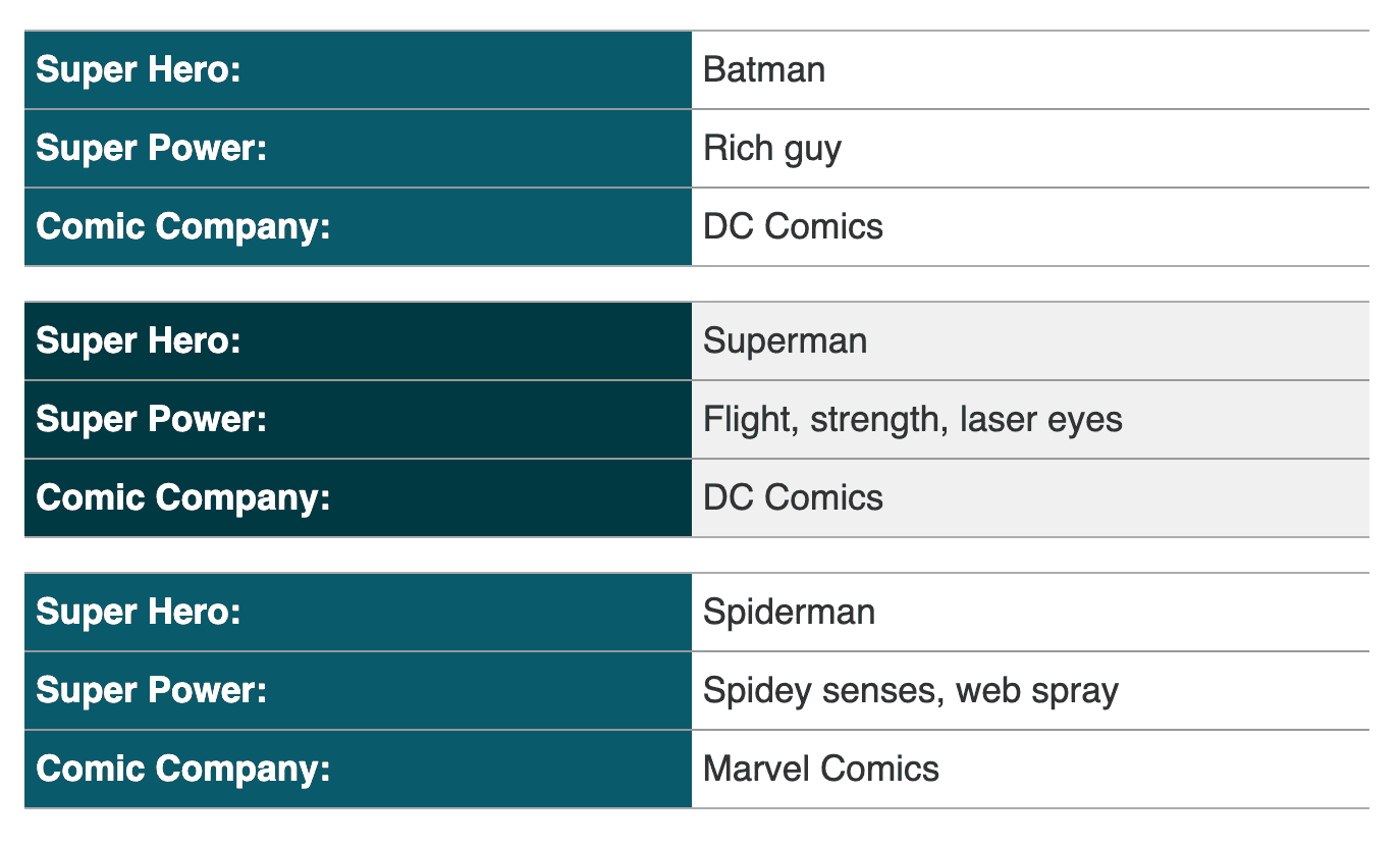
}Here is a reference to the CSS and HTML combined. This table is much more legible on mobile.
Conclusion/Key Takeaways
In conclusion, we now have a better way to handle tables at smaller screen sizes. One thing to note is if the table has more columns the user will need to scroll more. Here are our 3 takeaways.
3 takeaways:
- HTML tables are useful for data on desktop and mobile.
- Making the elements display as block elements allows us to adjust the display on mobile.
- We can make tables enjoyable for mobile users.
With this knowledge let’s make HTML tables enjoyable!
References
Example responsive table
About the author


Written by Nicholas Diesslin Pizza acrobat 🍕, typographer, gardener, bicyclist, juggler, senior developer, web designer, all around whittler of the web.
Follow Nick on Twitter!